Groups (or nesting) can be represented in a plot using a variety of methods.
Colour
Texture
Location / Strucutre (Geographic or Tree Map)
Use Cases
Resource Management - Database connections
The value we are interested in is a finite resource, max simultaneous connections. The resource is categorised by a by a variable called Access Type. This resource is allocated to by Component.
Variable: Component (or could be application or bulkhead)
Variable: Access Type [Read | ReadWrite]
Variable: Max Connections
Balance of Trade - Regional breakdown
Variable: Country
Variable: Continent
Variable: Exports
Plots
A Treemap is an advanced plot which uses position and structure to visualise grouped variables.
Treemap Plots
library(tidyverse)
library(treemapify)
Database Connections
Note: In my example a single component can have both write and readwrite allocations. So when presented in long format it must appear more than once.
connectionAllocation <- tribble(
  ~component, ~accessType, ~allocation,
  "reporting", "read", 10,
  "website", "read", 100,
  "admin", "readwrite", 10,
  "bastion", "readwrite", 5,
  "bastion", "read", 5,
  "payments", "readwrite", 25,
  "authentication", "read", 25,
  "signup", "read", 10,
  "cms", "read", 10,
  "batch", "readwrite", 25
)

ggplot(connectionAllocation,
       aes(area = allocation, fill = component,subgroup=accessType,
           label = allocation )) +
  geom_treemap() +
  geom_treemap_subgroup_border(color="black") +
  geom_treemap_text(place = "centre", alpha = 0.8, size=14) +
  geom_treemap_subgroup_text(place = "topleft", alpha = 0.8, size=16) +
  scale_fill_brewer(palette="Set1") +
  labs(title = "Database Connection Allocation", caption ="blog.badattribute.com")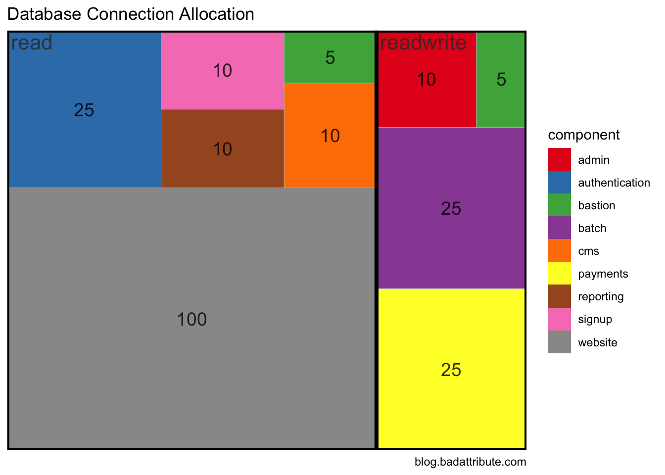
Balance of Trade
library(readxl)
library(httr)
library(unheadr)

loadAndClean <- function(url, direction) {
  GET(url,
    write_disk(tmp <- tempfile(fileext = ".xlsx")))
  xls <- read_excel(tmp)
  names(xls) <- c("country", "millions")
  xls %>%
    untangle2("EU|EFTA|Rest of World", country, group) %>%
    filter(country != "Total") %>%
    filter(trimws(country) != "") %>%
    mutate(direction = direction)
}
imports <- loadAndClean("https://www.ons.gov.uk/visualisations/dvc390/Importstree.xlsx", "imports")
## New names:
## * `` -> ...1## 3 matchesexports <- loadAndClean("https://www.ons.gov.uk/visualisations/dvc390/Exportstree.xlsx", "exports")## New names:
## * `` -> ...1
## 3 matcheslong <- rbind(imports, exports)
wide <- long %>%
pivot_wider(names_from=direction, values_from=millions) %>%
mutate(balance = exports - imports) %>%
mutate(unsignedBalance = abs(exports - imports))
ggplot(wide,
aes(area = unsignedBalance, fill = balance, subgroup = group,
label = country )) +
geom_treemap() +
geom_treemap_subgroup_border(color="white") +
geom_treemap_text(place = "centre", alpha = 0.8, size=14) +
geom_treemap_subgroup_text(place = "topleft", alpha = 0.8, size=16, fontface = c("bold")) +
scale_fill_gradient2() +
labs(title = "UK Balance of Payments 2016", caption ="blog.badattribute.com\ndata: Office of National Statistics")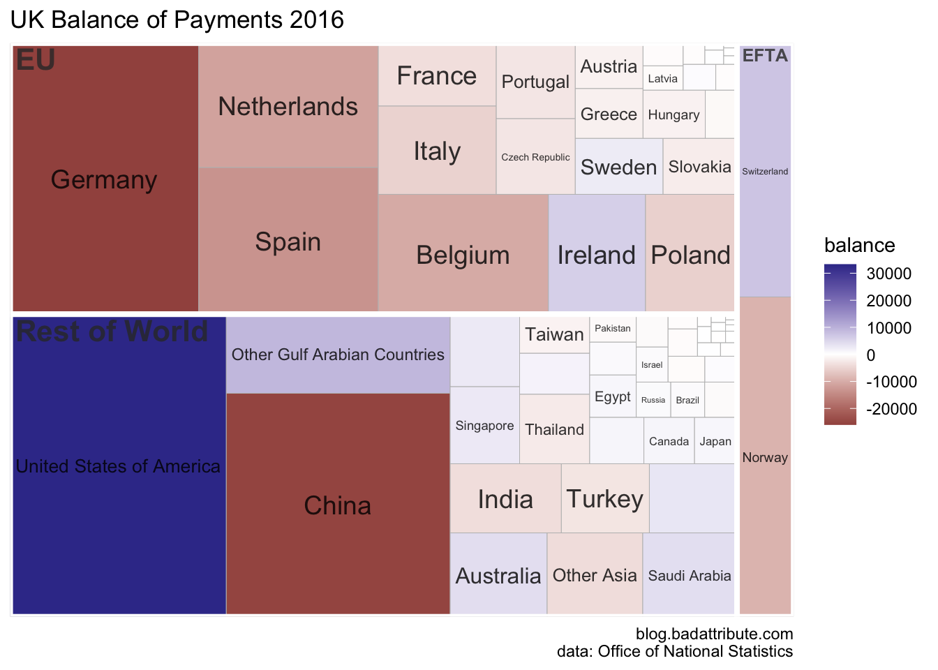
# devtools::install_github("jaredhuling/jcolors")
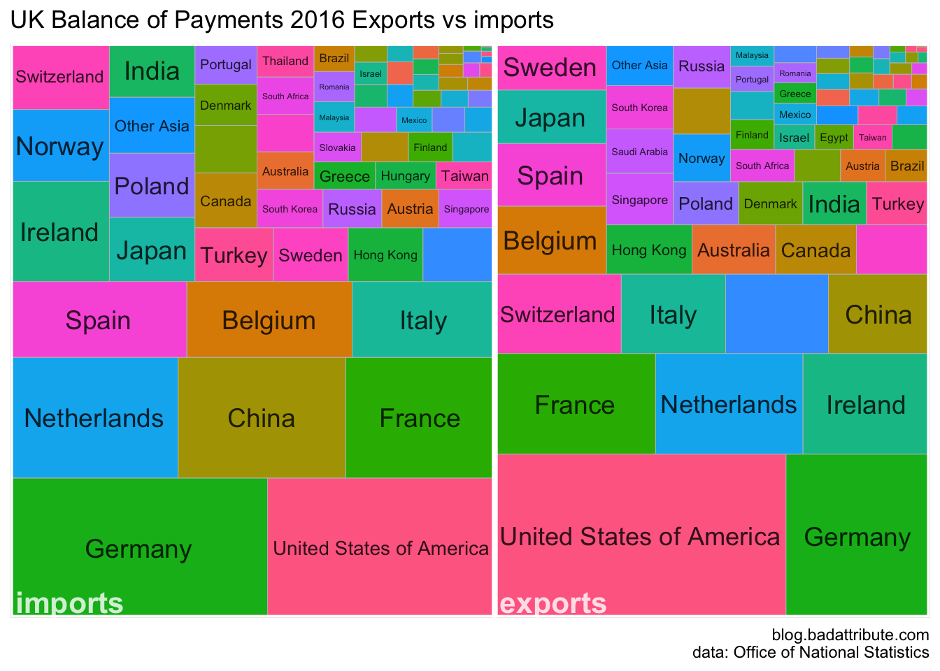
require(jcolors)## Loading required package: jcolorsggplot(long,
aes(area = millions, fill = country, subgroup = direction,
label = country )) +
geom_treemap() +
geom_treemap_subgroup_border(color="white") +
geom_treemap_text(place = "centre", alpha = 0.8, size=14) +
geom_treemap_subgroup_text(place = "bottomleft", alpha = 0.8, size=16, fontface = c("bold"), color="white") +
labs(title = "UK Balance of Payments 2016 Exports vs imports", caption ="blog.badattribute.com\ndata: Office of National Statistics") +
guides(fill=F)