Previous Plotting JMeter Results
Objective - Combined plot
In parts one and two we took output from a single JMeter run and visualised it with ggplot. More interesting for stakeholders and the technical team is a report showing progress over iterations.
Objectives
- A report compiled with R which takes 2 or more JMeter CSV files.
- A single chart used to compare average page load of slowest pages.
- A table with a row for every page, giving the percentage difference between oldest and newest versions.
Generate the report
tr <- list() # Test Report
tr$folder <- "/folder/containing/csv/data"
readLog <- function(filename, versionLabel) {
contents <- read_csv(paste(tr$folder,"/",filename, sep="")) %>%
mutate(version = versionLabel)
if (!has_name(tr, "log") | is_null(tr$log)) {
tr$log <<- contents
} else {
tr$log <<- rbind(tr$log, contents)
}
}
readLog("myapp_v0.1_results.csv", "0.1")
readLog("myapp_v0.2_results.csv", "0.2")
readLog("myapp_v0.3_results.csv", "0.3") JMeter CSV Log Format
The JMeter format was described in the previous JMeter article. In the readLog function an additional column called version ws added.
Aggregate
tr$summary <-
  tr$log %>%
  select(label, version, elapsed) %>%
  mutate(version = as.factor(version)) %>%
  group_by(version,label) %>%
  summarise(average=mean(elapsed)) %>%
  arrange(desc(average))
Identify slowest pages
For the final plot, ggplot will require the data in long format. Also I also want to order the samples by page so i can quickly see the improvement or detriment across for a page in the different versions.
I want to see the slowest pages regardless of version.
To identify the slow pages that will be shown in the graph, I will collect the data into wide form giving me one row for each page, add a column “slowest” with the slowest time for the page across versions, then sort and filter on this new value. To convert long to wide the function spread() is supplied by dplyr.
Limit to the 6 slowest pages
# For each page identify the slowest result across all versions.
tr$wide <- tr$summary %>%
pivot_wider(names_from = version, values_from = average) %>%
mutate(label, slowest = select(., levels(tr$summary$version)) %>% reduce(pmax))
# Add the slowest metric to the long form data
tr$osummary <- inner_join(tr$summary, select(tr$wide, label, slowest) ) %>%
arrange(desc(slowest), label, version) %>%
head(6 * length(unique(tr$summary$version))) %>%
mutate(label = as.factor(label))
# Reverse the versions factor for the desired result in the plot.
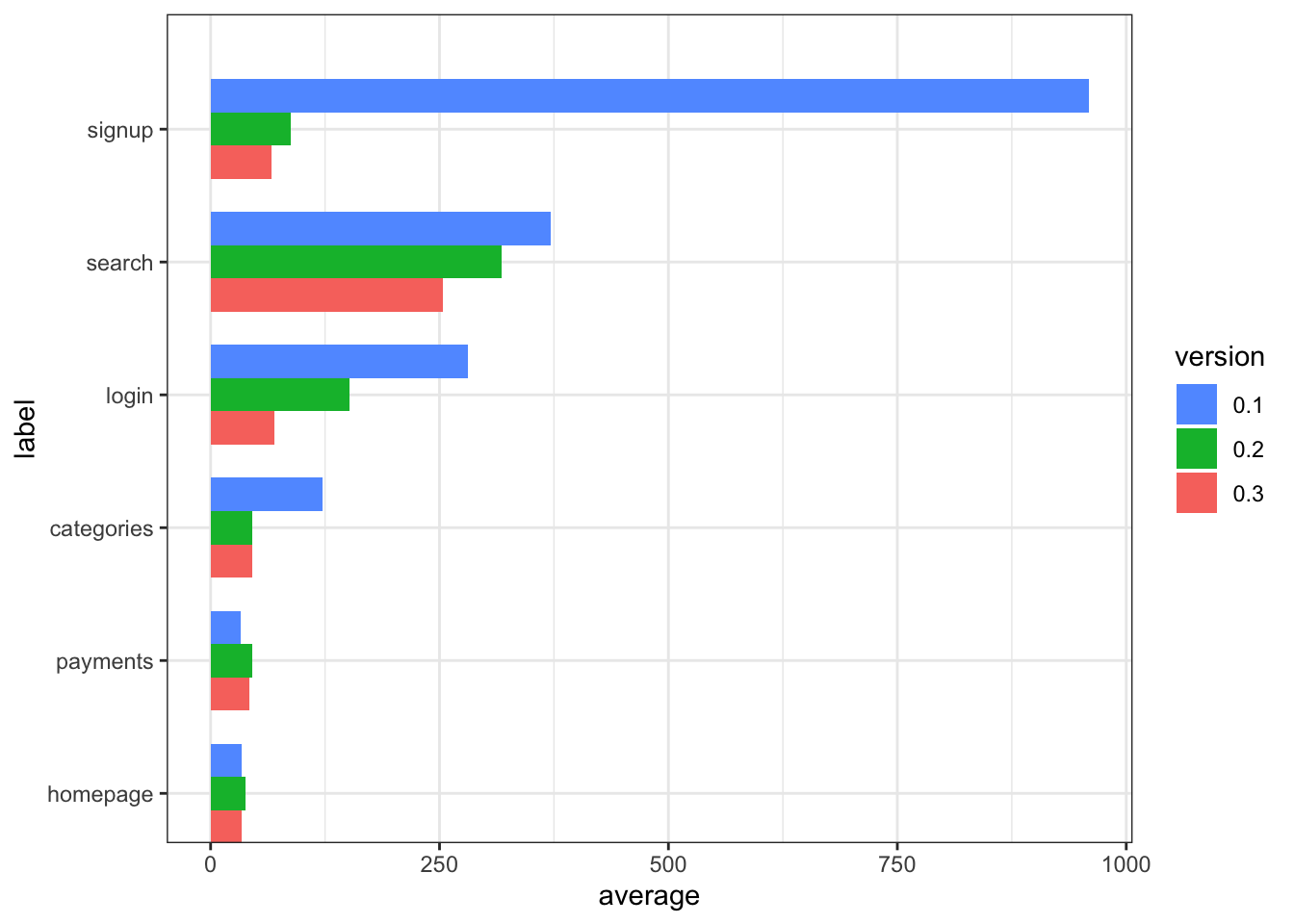
tr$osummary$version <- factor(tr$osummary$version, levels = rev(levels(tr$osummary$version))) Plot
positions <- rev(tr$osummary$label)
ggplot(data = tr$osummary,  aes(x=label, y=average, fill=version)) +
  geom_bar(stat="identity", position = "dodge",
           width= length(levels(tr$summary$version))*0.75 ) +
  scale_x_discrete(limits = positions) +
  coord_flip()  +
  scale_fill_discrete(guide = guide_legend(reverse=TRUE)) +
  theme_bw()
Table Breakdown
tr$v$oldest <- first(rev(levels(tr$summary$version)))
tr$v$newest <- last(rev(levels(tr$summary$version)))

tr$wide %>%
  mutate(improvement =select(., c(tr$v$oldest, tr$v$newest)) %>% reduce(function(old,new) scales::percent((new-old)/new))) %>%
  select(-slowest) %>%
knitr::kable()| label | 0.1 | 0.2 | 0.3 | improvement |
|---|---|---|---|---|
| signup | 959.00000 | 88.00000 | 66.00000 | 93.12% |
| search | 371.00000 | 318.00000 | 254.00000 | 31.54% |
| login | 281.00000 | 152.00000 | 70.00000 | 75.09% |
| categories | 122.00000 | 45.00000 | 45.00000 | 63.11% |
| payments | 33.00000 | 45.00000 | 42.00000 | -27.27% |
| homepage | 34.42857 | 38.61538 | 34.35714 | 0.21% |
| vote | 14.85714 | 14.42857 | 14.87500 | -0.12% |
Observations
The plot and table indicate that slow pages, anything over 1/4 of a second has been treated with significant succes. The search page is predictably the slowest but is working with respectable performance. Any change to the fastest pages is smaller than the number of significant digits used in the table formatting.
Conclusion
This approach has met the objectives. Because the code does not make any assumptions about the number of reports, the versions numbers or any other aspect, it could be included in a Continuous Integration flow with relative ease.
Goals for future exercise.
Add additional statistics to the table, 95 percentile etc.
Integrate with Continuous Integration.
- Add JMeter test run to a Jenkins job
- Add this R/JMeter report to a Jenkins job.